

From first assessment to executive dashboard, nothing sits in a spreadsheet.

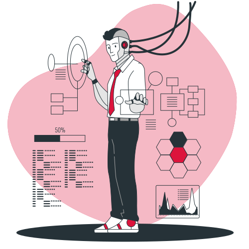



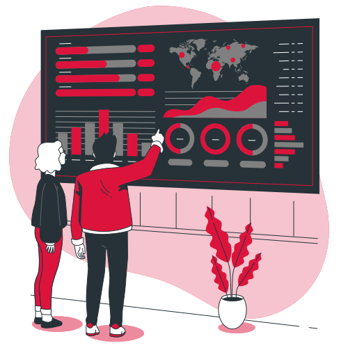
The HR Dashboard exists in two states, one for before the programme starts, one for after.
Live HRA completion numbers as employees enroll, a broad view of how many fall into each risk band, and the projected billing that comes with it, everything HR needs to track rollout progress and forecast cost before a rupee changes hands.
The same dashboard, now populated with real post-programme stats, adherence, engagement, and risk-band movement over time. This is where HR sees what actually changed, not just who signed up.
The Workforce Vitality Index, quarter-on-quarter movement, and high-risk cohort size, the same format your revenue dashboard already uses.
Aggregate workforce risk distribution, presented to support a healthier risk profile in renewal conversations, not a promised premium outcome.
Heat maps and department-to-department comparison, so risk gets addressed where it's concentrated, not averaged away.
Employee health data is sensitive, by law and by common sense. Healthness+ collects only what's needed to generate a risk profile and a plan.